8 Common Website Design Mistakes to Avoid
Your website design choices can dramatically help or hurt your business. Below are 8 design mistakes that you may need to update on your website right away.
1. POOR NAVIGATION
Your navigation can be fancy however, if it is not easy for the user to follow and understand, then they are going to leave your website without completing the task that you want them to complete on the specific website page.
2. SLOW WEBSITE LOAD SPEED
When surfing the web, people do not have the patience to wait for a website that is not loading in under just a couple of seconds. The website speed is determined by a few factors such as how optimized the assets are, what servers is all of the data hosted on, and how large the files are on the servers.
3. CLUTTERING SITE WITH CONTENT/UNORGANIZED CONTENT LAYOUT
If images, texts, and buttons are all jumbled together, it will prevent the viewer from taking any action on your website and most likely keep them from ever returning. You will lose their trust and loyalty as well as anyone else with who they share their thoughts and opinions.
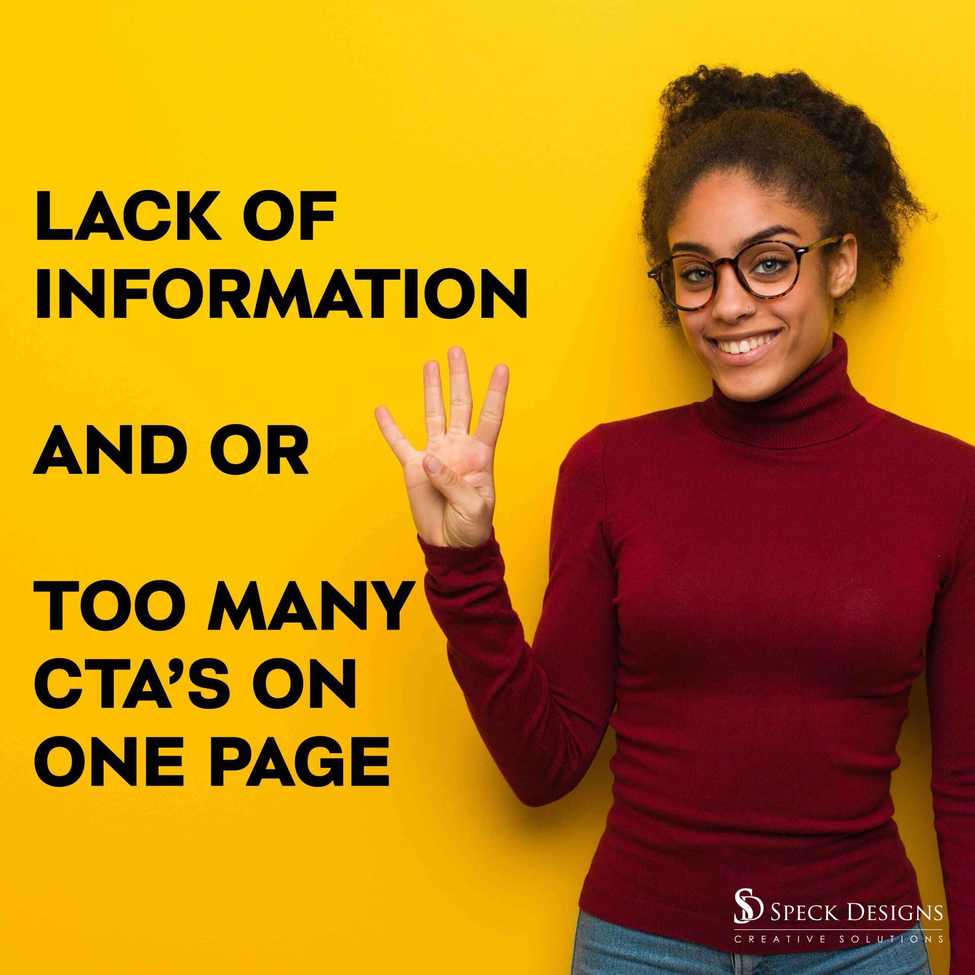
4. LACK OF INFO AND OR TOO MANY CALL TO ACTIONS “CTA” ON ONE PAGE
There is a fine line between too little content and too much content. You need to get your message across to your viewer without having a lot of text. Visuals keep people engaged and the text needs to be concise and simple to understand. Keeping one CTA per page is also a good rule to follow. Having an area on your website with multiple choices can create what is known as “choice overload” and the viewer may not choose any of the CTA’s.
5. SECURITY & RESPONSIVENESS
This one is short and to the point. If your website does not work on all screen sizes, you need to fix that. Also, if it is not secure, you are going to be missing out on on-site visitors. Web browsers nowadays, notify the user about an insecure website and ask them if they want to proceed or not. So, if your website doesn’t start with “HTTPS” you are missing out on your true website potential.
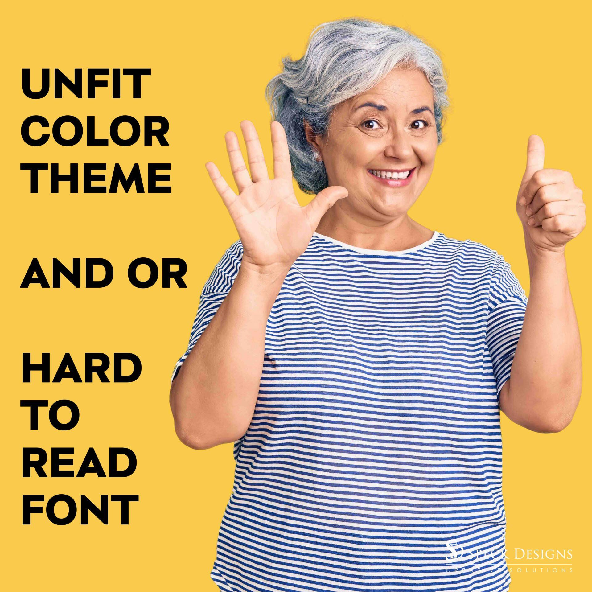
6. UNFIT COLOR THEME/HARD TO READ FONT
Yes, your website should reflect your brand colors and fonts however, you need to be careful how it is being perceived by the website user. Different colors represent different feelings, such as red being perceived as excitement, strength, love, and energy. You also need to make sure that all of your text can be read. Having a dark text color on a dark background or white text on a light image may be hard for the viewer to read and thus cause displeasure among your potential customers.
7. IMPROPER USE OF CALL TO ACTION “CTA”
The goal of a CTA is to increase your conversion rate. This means that the CTA needs to be eye-catchy and include the perfect amount of information so the website viewer will take action because they know exactly what to expect. All CTA’s need to be clear and engaging!
8. ANNOYING POP-UPS
Just like some of the other information we already covered, pop-ups that are used in the right way can be beneficial for your website. However, pop-ups can also destroy your accountability and reputation. No one wants to receive a pop-up right when they land on your site about a discount or offer that you are presenting. People want to search your website and learn about you first. There are times though such as if you have important information to share with the viewer in regards to your business where it is okay to have a pop-up show first thing as your website loads. You also need to keep in mind that website browsers allow users to block pop-ups and some people may never see your pop-up due to their browser settings. So, thinking of other creative ways to get your message across would be beneficial.
How is your website with the above list? Are there things you may need to work on but don’t have the time for? We would love to look over your website and provide you with our professional opinions and talk about the next steps we can take together to get your website on the right steps to success.
Do you have something that should be added to this list? If so, let us know.